Tuesday, November 26, 2013

Hey everybody, I'm back!

After a few blown laptops, I seem to have a working one again. Now it's time to get back to showing my painted minis, and telling you all what paints I used to get them done.

Her are a few teases, to show you what I have been up to over the last two years. Sorry it took so long to get back to this blog.


The write-up on Death Company Tycho will be up soon. Stay tuned:).

Cheers
 JAH

Friday, August 5, 2011

Death Company Tycho conversion.

Hello.


This is my version of Death Company Tycho. I was commissioned to build and paint this guy to be a replica of the Codex artwork for Tycho's entry in the Blood Angels book. The drawing is in black and white in the book, and Tycho is standing on a dead Chaos Marine. This didn't jive with the fluff for the iconic image of Tycho alongside the Death Company on Armaggedon. A little research dug up the original color version of the artwork, where Tycho is indeed in his traditonal gold armor.

I built the original version as a mock-up, with Tycho standing on the Chaos Marine, and as soon as I posted it online, there uproar began. "DC Tycho has to standing be on an Ork!", the masses shouted, and they were right. Luckily, I happened to have a plastic Nob from the Boys box handy. I think V2 of the base is certainly more iconic, and includes a little skull with a bullet hole in the forehead from the Black Reach Termies, because every GW mini needs a skull on the base;).

For Tycho himself, I kept the build pretty simple, as the latest Blood Angel kits are beautiful. The arms, legs, head, right shoulder pad, and the front of the torso are all from the Sanguinary Guard.  The backpack, wing icon, left shoulder pad, and the back of the torso are from the Death Company box. The gun is from the Commander box. I think the cloth hanging from his right shoulder pad is from the Command Squad box, but it may be from the Termie box. The final little addition was an extra purity seal on the left leg. The Tycho in the artwork is a little more ornate, but since I knew this mini would see time in my client's army I wanted him to be a bit more rugged so parts don't fall of if you pick him up.

As far as converting and sculpting, I only had to cut a few parts away, like the Blade Encarmine from the right hand and the Angelus Boltgun from the left. I cut the big blood drop off of the wing icon so that I could sculpt the three blood drops for Tycho's Third Company badge, and used the big blood drop to cover the spot where I had cut the boltgun off. I cut the Sanguinary Guard legs at the right hip to get my pose, and then sculpted a bit of armor to cover the gap. Lastly I sculpted Tycho's mask, using two little bits of paper clip for the pipes coming out of the side instead of trying to get Greenstuff to stay put.

The base is pretty simple. Sand and cork board, done at the right angle to make sense of Tycho's pose. The Nob is built straight out of the box, with a bit of tread on his boots done by rolling the handle of my Exacto to make a pattern in the Greenstuff. Any excess that had gotten pushed beyond the boot sole was allowed to cure and then trimmed off. Viola, one easy boot tread. Well, two actually:).

The greenstuff rim around the back of the base is there to stop the rubble slab from looking like a random pile to strike a pose on. I've seen it done on minis before, and I always found it stops the eye, and lends an illusion of a scene existing beyond the base. We'll see how it works out.

Now it is time to get painting. I have Tycho's finished look pretty much figured out in my head. I'm not sure how I will paint the Ork. The trick will be to paint him in a subtle way, so that he doesn't dominate Tycho, who will be black, with a touch of red, gold, and white. It will be a challenge for my color selection skills, and a new aspect of composition to tackle, since this is the first time I've painted two minis interacting together. Wish me luck.

Thanks for looking.

Cheers
 JAH

Wednesday, June 29, 2011

Tyrant Xerxis

Hello.

Well, it has only been about 10 months since my last post! Some of you may have thought I died, or gave up painting, neither of which are true. Last September my girlfriend and I bought a surf shop in Sayulita Mexico, and moved down here to live the good life in a tropical paradise. It has been a long hard road to get adjusted to our new lives, but things could not be better with the business, and I am finally back at the painting table refreshed and on a mission.

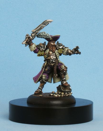
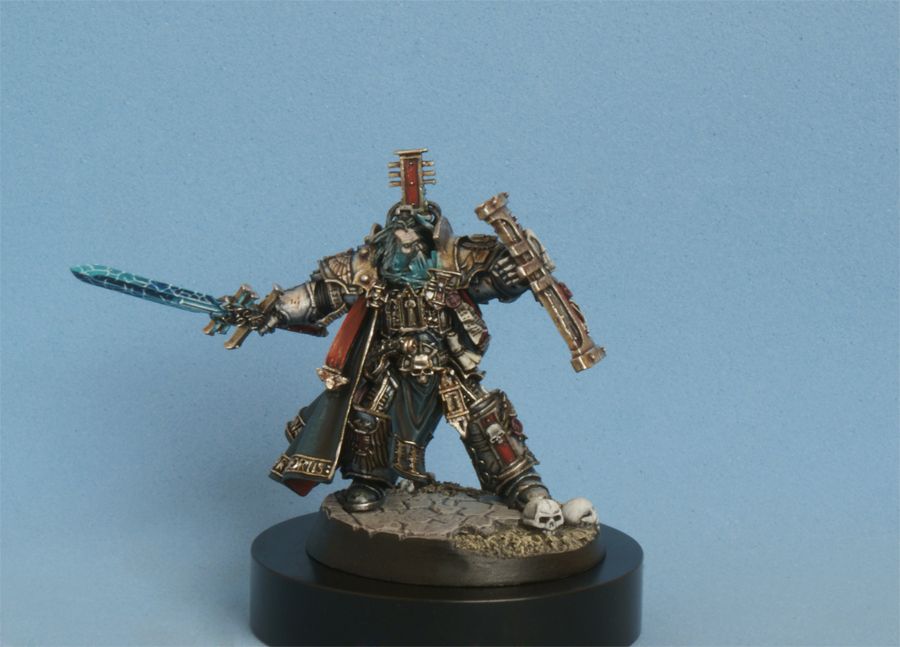
This latest commission has been a long time coming, but is finally done and dusted. The tyrant Xerxis has been a favorite of mine since he was released by Privateer Press years ago. I am stoked I finally got a chance to paint him, and it was good to get to use another one of Wil Davies' excellent Voodooworx display bases.

I hope you like the finished product:


The full 360 can be found here:

http://www.coolminiornot.com/279686

Close-up shots are here:

http://www.coolminiornot.com/280286

I am often asked why I don't post WIP's of my work so people don't have to wait so long for the finished pics of my latest commission. The main reason is that I hate photography. I've never been a big fan of technology, and resisted buying a camera and laptop until just 3 years ago. Of course, since I took the leap I am now in whole hog, and could not imagine going without my internet, and am currently having a not so secret love affair with my ipad.

The other big reason is that I am always experimenting and pushing my skills with each new commission. Basically, what this means to me is that I feel like I don't actually know what I am doing, and the finished piece is the end result of a lot of trial and error. Every step looks like shit to me, but it all seems to come together in the end. It just takes a lot more hard work to get there than it should. Hopefully in a few years I will have fully developed my style and skills to a place where I am finally comfortable and efficient with my painting.

I have also been asked why I only talk about mixes, and not technique. It is easy to describe the colors used, and the ideas behind them. It is much harder to type about how I actually apply the paint and get my results. I think video is the only real way to share the technique with a brush, and there is no way I want to share the struggles and frustration I go through over the weeks I work on a single mini. By the time I am done with a mini I hate it with a passion, and never want to see it again. I am, however, always happy to see that each piece gets better scores on CMON, brings in more commission requests, and shows that I am constantly working beyond my "comfort zone".

Like a lot of painters, I have dreamed of winning a Slayer Sword for years. Since I have never really been a gamer, but have been captivated by the art, stories, and sculptures of the mini world for over 25 years, joining the ranks of the world's elite painters has always been the driving force behind why I pick up the brush. I have a long way to go, as I don't seem to be blessed with a natural talent for painting, by which I mean I struggle with the brush more than just having results unfold easily. So for anyone who has big dreams, but feels like they fail to get the results they want, it is all about hard work. No video tutorial will ever replace hours upon hours of practice.

O.K., glad I got that off my chest. If you are still with me, here are the colors I used to paint the Tyrant.

Once again, I was asked to take the Privateer Press studio scheme and recreate it. Using mostly P3 paints, I got to work.

Since the reds are the dominant part of this mini I started with them first. I wanted a different tone for the armor than I did for the cloth, but both start out the same. Over a black undercoat I started with Sanguine Base on the smooth armor plates and the cloth. Once everything had a nice smooth basecoat, I stated thinking about my light source. I decided that the light would be coming from above, but slightly behind him over his left shoulder, so that I could play with a little bit more dramatic shading and highlighting than just having an overhead lightsource.

For the armour, since I knew I would be painting shadows in, rather than just layering up to my highlights like I used to, I put down a solid coat of Skorne Red. Since this was the basic tone I wanted the armor to be I started shading, keeping the direction of my lightsource in mind. I started with a wash of GW Leviathan Purple. This enriched the red a bit, as well as running into the cracks and seperating the armor plates from the gold trim. Carrying on with the purple tint I mixed S.R. with Gnarls Green 2-1. This almost made Sanguine Base, but slightly more red. I painted this mix in where I wanted my shadows, and then cleaned up the blends with pure S.R. again. Happy with the result, I moved on to highlights. I wanted a gradual transition up until that final stark line at the extreme edges, so I used about six layers of slightly brighter tones. Starting with Khador Red Base I started to build up my highlights, being careful to leave some Skorne Red showing. I gradually worked my way around where I wanted the light to hit using a mix of Khador Red Base mixed with Heartfire, first at 2-1 K.R.B + HF, then 1-1, then 1-2 K.R.B + HF, and finally a 1-4 mix which is quite orange, but somehow more subtle than Khador Red Highlight. The last bit of highlight is more of a stark line to make things "pop" just a bit. This was a straight line of Khador Red Highlight, followed by a streak of H.R.H. and Morrow White at 4-1. Once that was all done I brought it together with a few glazes of Red Ink.


Next I tackled the red cloth. This had already been given a basecoat of Sanguine Base, so I started to build up how I wanted the creases and ridges to be hit with a 2-1 mix of S.B. and Skorne Red. The shadows were done with my 2-1 mix of S.R and Gnarls Green, just like the armor. Happy with the shadows, I moved on to the highlights. Starting with a 2-1 mix of S.R and S.B., through a 4-1 mix, and then pure S.R. layer. Next came a pure layer of Khador Red Base, careful to keep the paint thin enough to blend over the S.R. layer. Then came a layer of K.R.B. and Heartfire at 2-1. At this point, everything was basically the same tone as most of the work I did on the armor. Where I switched it up was on the final highlight, which was K.R.B. mixed with Menoth White Highlight. This gave a slightly pink color, which was toned down with a few thin layers of Red Ink.


Having painted the red flags in his back, it was time to move on to the giant bone horns/claws (?) sticking out the front. I started with a standard coat of Battlefield Brown. This was basically completely covered with a layer of Gun Corps Brown, except for some of the deep ridges along the base of the horns. Then came a layer of Hammerfall Khaki, being midfull to leave some G.K.B. as a shade under the curves at the tips to reinforce the lightsource. Covering slightly less space from the base toward the tips, came a layer of Jack Bone, then Menoth White Base, then Menoth White Highlight, and finally a bit of Morrow White. Easy peazy, but the shadow under the tips of the horns really makes it work for me since when viewed from the front it really sells the direction of the light.

Before I did the gold on the helmet, I painted Xerxis' face. Since the studio Skorne have a very unique skintone I started with Rucksack Tan as my base. To keep with the slightly purple tones in the shadows of the reds I shaded his face with a wash I made from Skorne Red and Thronwood Green in equal parts. After a little clean-up with the Rucksack Tan again I moved on to the highlights. The first layer was a 2-1 mix of R.T. and Menoth White Highlight, followed by a 1-1 layer, a 1-2 layer, a 1-4 layer, and finally pure M.W.H., gradually hitting less and less of the face except where the light would fall. The eyes where painted with pure Thamar Black, and given a white dot as a highlight, since I like the look of the glassy black alien eyes that the studio Skorne have. His lips where given a thin layer of Beaten Purple after I had picked out the teeth with a coat of Menoth White Base followed by pure Morrow White.

Now I was ready to do the gold, which is a big part of this mini. First came, as always, a layer of Battlefield Brown, then a very solid layer of Rhulic Gold. To tie in with the purple tones of the overall scheme I shaded the gold with a heavy layer of Flesh Wash(P3's version has a very purple tone). I started to highlight with  a 2-1 mix of my R.G. and Vallejo Model Air Gold. I am finally starting to get the hang of working with this very dominant gold paint. I feel the it really needs to be mixed down for the main tones as it is such a strong color. I still found my mix a bit bright, and gave it a liberal wash of GW Leviathan Purple. The highlights continued through a mix of R.G. and V.G. at 2-1, then pure V.G., and finished with a fine highlight of pure Vallejo Air Aluminium. Not very complicated, but man was there a lot of gold to paint.


There was still a bit more gold to paint in the form of the textured plates on the armor and maces. This was a much easier process since I just gave them a coat of the Vallejo Air Gold, followed by a wash of Red Ink, and then little stipple of the pure gold again.

Next up where the black bits. He has black cloth, armor bits, and gems, but they are so small that I painted them all with the same mixes, instead of trying to get different tones like I did with the reds. I started with pure Thamar Black, and a initial highlight of pure Coal Black. This was followed by two layers of C.B. and Underbelly Blue, first at 4-1 and then at 2-1. This was toned down with a very thin wash of pure Thamar Black, and then the final highlight was lightly done with pure Trollblood Highlight.

I finished by painting the steel of Xerxis' maces. I wanted to try for a heavily shaded "Demi-Metallic" look, so after a basecoat of Pig Iron I put down a heavy coat of Armor Wash. This was cleaned up with P.I. again, and then given an initial highlight of GW Boltgun Metal. To tie in with the rest of the mini, and maybe give the impression of a magical weapon, i used the GW Leviathan Purple wash again. The final highlight was Vallejo Air Aluminium.

With the mini done, it was on to the base. This is another great resin display base from VoodooworxUK. Some people have said that the base is too tall, leaving way too much black space to distract the eye away from the mini. I agree, this base could have been half as tall, but the sculpted detail on top is great. Very nice stone work.

To continue the colors I used on the mini I started with a basecoat of Rucksack Tan. All the cracks and crevices where given a heavy wash of GW Gryphonne Sepia, and then cleaned up with R.T. again. At this point I was note happy with the tone of the base, so I covered all the R.T. with a 1-1 mix of R.T. and Menoth White Base. I still didn't like the color, so I tried pure M.W.B. to see if that would do the trick. It didn't. The lack of texture and contrast was uninteresting. The solution was to shade with a wash of Bloodstone instead of sepia, as the Bloodstone is a very red-brown and matched the mini better, as well as being a richer tone. then for texture I used a piece of foam from a blister pack to stipple alternating layers of Bloodstone, Menoth White Base, and Menoth White Highlight. That did the trick. For the exposed Stone under the stippled bits I wanted a different tone, so I just washed my M.W.B. layer with Bloodstone, and then hit the edges with M.W.H. and got the result I wanted. The dirt was drybrushed with the same series of colours, but in the traditional dark to light manner. A couple coats of black around the edges of the base finished everything off, and he was ready to be shipped to his  happy new owner.

Thanks for having taken the time to read this. I hope that some of you found this write-up helpful.

I'm off to finish my next project, a plastic version of the Blood Angels Commander Dante, where I am experimenting with shading my gold using Sanguine Base.

Cheers
 JAH

Tuesday, August 17, 2010

The Butcher of Khardov

Hello.

Here is my latest commission piece. This is my first proper display mini. Everything I've ever painted before has been on a legal gaming base. It was nice to place something on a bigger, more detailed base. The one I chose to use is a resin plinth base from Voodooworx UK, a new company that is the brainchild of Wil Davies (a very good UK painter). I have a few more that I will be using, and I'm very happy with all his designs.

My brief for this job was to take the studio paint scheme, and make it better. Not an easy task!

The full 360 view of the close-ups is on Coolmini here:

http://coolminiornot.com/257412

Some full view shots are on this page:

http://coolminiornot.com/257232

Now on to a couple of pics, and the breakdown of how I painted this psychopath.


To start, since the customer wanted a version of the studio scheme, I bought the Khador army book. The painting section of the book is very well done, with very clear step-by-step pics. All I had to do was build on their work.

As usual, I started over a Black undercoat. I like to lay down a basecoat of Sanguine Base when I'm doing Reds. It covers well with two coats, and is a great color to build off of. Normally I would start mixing Khador Red Base into my SB, and slowly start building up lighter layers of color, but I changed my approach for this guy. Since I knew that I would be shading with a deep Blue tone, I just skipped straight to an overall layer of KRB. With a nice solid base of Red to work from, I started adding shadows and highlights.

I came back in with the SB to establish where the shadows would be, and then made a mix of 1-1 SB and Exile Blue. This made a nice Purple tone for shading. For the first set of highlights i went straight to Khador Red Highlight. it's a bit of a jump from the Red to the Orange, but it would all be tied together with some Red Ink glazes at the end. The final edge highlights were a 1-1 mix of KRH and Menoth White Highlight. This made a nice peach color, that would be toned down with the glazes after I painted on the battle damage.

The battle damage is hand painted, with the very tip of my brush. First I painted the chips on with Thamar Black, concentrating mainly on the edges, which would be doing the most bashing in a hand to hand fight. I made sure to get the elbow, knee, and toe armor pretty dinged up, so it looked like he would use these parts of his body when in close. The belly and groin plates where hit with spots that look like he's had a few bullets bounce off as he wades in. The middle of each black spot was given a dot of Greatcoat Grey to add a bit of dimension, and the edges where highlighted with my KRH/MWH mix to match the Red highlights.

The armor was finished off by about ten layers of Red glaze. This is a mix of water and Red Ink, diluted about 15-1. It takes about five layers before you start to see a change, and then it just gets deeper with each layer, and slowly brings all the colors together.

Next I painted his leather pants. They were based with Battlefield Brown, then shaded with pure Thamar Black. Normally I would start mixing in Gun Corps Brown for the highlights, but I wanted to do something a little different, and go for a Red tone. I mixed some Bloodstone into the BB, and just played around until I had a look that I liked. I think I used a ratio of about 1-1.

For the boots, I wanted a different tone completely, so I started with a 1-1 mix of Battlefield Brown and Thamar black. I started highlighting with pure BB, and then finished off the folds and edges with some very thin Gun Corps Brown. To match the chips on the toe armor, I scuffed the boot toes with some Hammerfall Khaki, using a crosshatch pattern.

The coat is done using the instructions in the army book. The first layer is pure Thornwood Green. This is washed with a 1-1 mix of Cryx Bane Base and Battlefield Brown. Then the darkest shadows are painted in with a mix of Umbral Umber and Gnarls Green. I don't actually have the Umber, so I just made some using a 1-1 mix of Thamar Black and BB. The first highlights are a 1-1 mix of Thornwood Green and Traitor Green. The final highlight was this mix with  1-1 mix of Cryx Bane Highlight and Thrall Flesh added in. The I came back with my Umber mix, and nicked up the edges of the coat a little.

Now it was time to tackle the metals. As usual, my steel bits were basecoated with Pig Iron. This was shaded with a mix of Armour Wash, Coal Black, and Exile Blue. I used this wash a few times throughout the different stages, so just play around with a mix until you get something you like. It should have a blue tone, which compliments the blue tone in the red armor's shadows. A layer of GW Boltgun metals is used for the first highlight, followed by a wash of Vallejo Smoke to add a bit of Age to the steel. The final highlight is Vallejo Air Aluminium, which really pops.

The heaviest use of the Vallejo Smoke is on the metal plates around his coat, which I felt would be the dritiest, and most worn metal parts.

The bronze areas are first covered with Battlefield Brown, which makes a nicer base for Golds, Coppers, and Bronzes than Black does. A mix of my vintage 90's Dwarf Bronze and BB, at about 1-1, is used for the basecoat. Pure Dwarf Bronze come next. This is shaded with PP Flesh Wash, which has a nice pruple undertone. For the heavy shading I used my Umber mix. For the highlights I mixed my DB with some VA Aluminium. This is washed with GW Ogryn Flesh Wash to keep the Red/Blue/Purple tones coherent through the whole mini. One final layer of the highlight color finishes everything of.

The blood was stippled on in a few layers. First I used Sanguine base to lay out where i wanted the blood to go. It was the stipple with some Skorne Red, foloowed by Khador Red Base, and then finally some SB mixed with a spot of Black to tone it all down a little, and make it a little more gory.

I did the simple wood grain pattern on the shotgun with a base of Battlefield Brown. Then I painted fine lines of Thamar Black, and highlighted my BB lines with pure Gun Corps Brown. Simple, but effective.

The leather holster, belt, and front straps were done with the same exact colors as the wood, just with Gun Corps Brown as the dominant color.

Next I painted the Black bits. The first highlight was pure Coal black. The next was a 1-1 mix of CB and Underbelly Blue. The final highlight was a 1-2 mix of CB and UB.

For the fur, I wanted to try something new. I didn't want to just have White fur with Grey shadows. I wanted to liven it up a bit. I started with a basecoat of Greatcoat Grey, which has a nice blue tone to it. Everything but the deep shadows were then given a coat of pure Trollblood Base. At this point, the fur was basically turquoise, and I thought I was crazy. Then I started mixing in Some Trollblood Highlight at 1-2, and had a nice color to work with. Next I picked out every tuft with pure TH. A light wash of TB later, and there was some nice contrast and interesting tones goin' on. A final overall highlight with 1-1 TH and Morrow White did the job. This was finished with some pure White to reinforce the overhead lighting.

Now I was ready to paint the head. First coat, as always is some Battlefield Brown, followed by Khardic Flesh. The first highlights of Midlund Flesh were painted, and then two seperate washes were added. The first was Thornwood Green, and the second was Skorne Red. At this point, I was following the book, but the customer wanted a Red face, that looked like he was workin' hard. I highlighted all the way up to Ryn Flesh, and then came back with some very thin glazes of Skorne Red to tint the face.

The stubble on his head is a 1-1 mix of Greatcoat Grey and Khardic Flesh. The teeth are Menoth White Highlight, the tongue is Sanguine Highlight, and the eyes are MWH with a Black dot.

The Kommander rank badge on his chest was freehanded on with Heartfire, followed by Cygnus yellow, and finished with a 1-1 mix of CY and White. Any little mistakes were cleaned up with Skorne Red, which also provided a bit of an outline. It's a tiny space though!

Finally, the customer wanted a furnace glow in his boiler. It was done with progressive layers, starting with Sanguine Base, followed by Skorne Red, Khador Red Base, Heartfire, Cygnus Yellow, 1-1 CY and White, and finished with pure White in the grill. I stopped at CY on the exhausts, so the light looked deeper down, and then hit them with mu Umber mix for a bit of soot around the pipes.

That's about it. I hope that this has answered any questions about what colors I used.

Thanks for taking the time to read this.

I'm off to start the next job now, the Tyrant Xerxis!

Cheers
 JAH

Saturday, July 17, 2010

Heralds of Light Space Marine Captain

Hello.

Today I would like to talk about painting my latest finished commission mini. Sadly, I'm not nearly as good with the camera as I would like to be, but my rubbish pics will have to do.

A lot of people seem to struggle with painting White. I am still learning a lot of lessons with each new paintjob, but I don't find White to be any more difficult than any other color. The most important thing that I have learned about painting is patience. It takes patience to apply all the smooth, thin, layers to get a nice solid color, and to make all the mixes that give the smooth transition from dark to light. It also takes patience to wait for a layer to dry fully, so you can see what the color actually looks like (since colors dry a little different from how they go on wet).

Enough rambling. On to the pics, and then the build/paint write-up.


The Heralds of Light is a Space Marine Chapter that was created by  a guy (Codex Grey) over on the Bolter and Chainsword forums. The idea is that, although there is a Chapter symbol, each Company has a unique set of Heraldry. In this case the Chapter symbol is on the right kneepad (the star), and the Company symbol  (the flaming tower) is on the shield and shoulderpad. 

When I was asked to do this job, the first thing the customer specified was that he wanted the Captain to be armed with a Power Sword and a Stormshield. He wanted to use the Warhammer Fantasy Empire shield, and he wanted the tower and flame symbol sculpted on.

After drawing up a few sketches of different tower and flame options, we settled on a design. I had originally planned on sculpting the stonework and flame, but when I got started, I realized that I can paint much finer detail than I can sculpt. I'm not much of a sculptor yet, as this is only my second attempt at anything beyond filling gaps, so I just sculpted on two flat towers, and would come in and paint the rest of the details freehand.

I chose to use the Bionic Arm that wields a Chainsword from the Captain kit. The guard on the hand seemed to make a nice base as a grip for the shield. After gluing the shield to the hand, I sculpted a few powerlines for the Stormshield on the inside, to give a bit of a Sci-Fi element, and glued a Purity Seal on, further reinforcing the 40K element.

The shoulder pad that I chose to sculpt the tower onto is from the new Blood Angels. It already had a purity seal on it, but it was designed for an arm the is hanging down. Since this guy's arm would be horizontal, instead of vertical, I had to cut the parchment off and sculpt one that is hanging more naturally. This was my first time trying to sculpt any flowing paper, and was a bit of a scary prospect. In the end, I'm happy with the result, even if it is a bit big;).

After all was said and done, here is the arm I ended up with.


The Sword was one I had left over from cutting a Sanguinary Guard arm up for a Death Company Tycho sculpt I will be working on next month. It's fuckin' huge! Nobody seems to mind that this guy is wielding a sword as big as himself with one hand, so it's all good.

Everything else is just a straight build using the Space Marine Commander kit. The entire mini is plastic, or Greenstuff, and he sits on a resin base from Dragonforge Design. He's as light as a feather!

Now that I had built him, it was time to slap some paint on. The color scheme had, for the most part, already been worked out, so I dove right in. Unless I'm working with glazes I like to start from a Black undercoat. Since this guy had a lot of metals and dark Blues, I only had to worry about how to build up a nice White over the Black. P3 paints have some wonderful coverage, I wasn't too worried.

To start, I painted all of the armour Greatcoat Grey. This is one of my favorite P3 colors, and covers Black easily. Next I painted everything Ironhull Grey, being careful to leave the Greatcoat Grey in the cracks to act as my liner. From there I started to slowly build up my White by mixing Morrow White with my IG. After each layer was complete, and dry, I would add more White to the mix, until I worked up to pure White. The ratios were 1-1 MW and IG, then 4-1 MW and IG, then 6-1 MW and IG, then 12-1 MW and IG, and finally pure White. By building up each layer slowly, and using thin paint, I achieved a smooth White with no chalkiness or half-ass coverage. Usually the first layer of each new color would have a little of the last one showing through, and look a bit patchy. Two coats of each mix did the job though.

The main thing that I learned painting this White is that the lighter each successive layer got, the darker my previous layer looked in comparison. My Greatcoat Grey now looks like Black in the cracks, and my pure Ironhull Grey shadows looked way too dark as well. I had to fiddle with things a bit, and ended up using my 4-1 mix as my main shadow color. It was still a bit stark in places, so I gave the shadows a fine glaze of 6-1 mix to help the transitions a bit. It really is amazing how light colors make your darks looks so much darker. This was a learning experience to be sure.

The Golds are my standard recipe. The first layer over Black is always Battlefield Brown. This is an easier color for the Gold to cover, and keeps me from having to lay on the Gold too thick. Next is a solid layer of Rhulic Gold. This was covered completely with a mix of Rhulic Gold and Vallejo Air Gold in a 2-1 ratio. Vallejo Air Gold is a very strong color, but I like the way the Rhulic tones it down a bit. Next came a wash, to shade, with P3 Flesh Wash, which has a nice Purpleish hue that I like my Golds to have. The first highlight is pure VAG, and the final highlight is pure Vallejo Air Aluminium.

The Blacks are all done with my standard recipe. First a layer of Coal Black to establish where I want the light to reflect. Then  a layer of Greatcoat Grey, and then a layer of GG and Trollblood Highlight mixed 1-1. Simple.

Soft armor joints are done the exact same way, but I skip the Coal Black step, as it won't  show up anyway.

For the Blues, I knew I wanted to have a few variations in tone. The leathers would be the darkest, with the tassles being the lightest, and the cloak somewhere in the middle. I started with a layer of Exile Blue on everything. Next came a layer of Cygnar Blue base, followed by a layer of Cygnar Blue Highlight. I used both of these colors only on the raised edges of the leathers so they would retain a very dark look. The cloak and tassles got broader coverage with these colors to brighten them up a bit more. Next I painted the edges of the cloak and the tassles with a 1-1 mix of the CBH and White. The tassles were then given a final highlight of White and CBH at a 2-1 ratio.

When it came time to paint the towers, I wanted to experiment with the sponge stippling technique a bit. I started with a solid coat of Greatcoat Grey, and then stippled a 1-1 mix of GG and Trollblood Highlight. This was hit again with a pure layer of TH. This gave a nice textured stonework effect. Then I painted fine lines of GG to create the stone blocks. The windows were painted in with Black, to give them more depth that the stone block lines. Finally, each block was highlighted with pure White to complete the 3-D illusion.

The glowing eyes, flames, gems, and power effects were all painted with Arcane Blue. To start I mixed a color with a 2-1 ratio of AB and Coal Black. This created a nice color for covering Black, but wasn't too harsh of a jump in tone. Next came pure AB, followed by a mix of AB and White. I don't remember the exact ratios, but it was definitely heavier on the White. I just played around until I had a look that I liked. I'm still new to any kind of OSL effects, so it was fun to experiment. I will definitely be playing around with this effect more in the future.

The freehand Chapter symbol, and the eagle design on the back of the cloak, were done with the same mixes that I used for the White armor, but I stopped at the 6-1 ratio, instead of going up to pure White.

The Purity Seals are done with my standard recipes. The seals are based with Sanguine Base. While the parchment is based with Battlefield Brown. The seals are given a coat of Sanguine Highlight, being careful to leave the SB showing in the deepest recesses. They are finished off with a highlight of SH mixed 1-1 with Menoth White Highlight. The parchments are worked up through Gun Corps Brown to MWH, and the very edges highlighted with pure White. The text is done with scribbles of thinned Black.

Finally, for the base I wanted to play with the sponge some more. I layed down a basecoat of Bloodstone, and started washing it with multiple layers of GW's Ogryn Flesh wash. Then I started mixing Jack Bone with the Bloodstone and sponged that on. I alternated between adding more JB to the mix, and washing over each layer with the OF to bring it all together. The effect was a bit subtle for the camera, but has a nice stone texture to the naked eye. Definitely a technique I will use again.


I tried a lot of new stuff on this guy, and learned a lot throughout the process. Now it's time to take the lessons learned, and apply them to my next commission.

I hope that you have found this write-up useful, and that it will push you to try new things as well.

Thanks for looking.

Cheers
 JAH


Wednesday, July 14, 2010

What the hell happened to June?!?

Well, everything I touched turned to shit last month.

My plastic Commander Dante Mini, that I was painting for ebay, decided to assault the vacuum cleaner, and lost. He will live to fight another day, after some minor repairs, and hopefully see the light of day by the end of the month.

Everything I tried on June's commission mini went wrong, at least twice. The heatwave we had here in Portland didn't help with trying to finish off the fine freehand detail, in white. Thanks Mr. Sun. Jerk.

I pushed on, and finally finished him. The customer is very happy, so I can't complain.

I will have a painting write-up for him in a couple days. Until then, here's a little teaser, and the voting link.

Enjoy.

http://coolminiornot.com/254853


Thanks for looking.

Cheers
JAH

Wednesday, June 2, 2010

What's on deck for June?

Well, April and May were a disaster. Finishing one mini a month is not a very good way to make a living, even if they do go for a few hundred bucks a piece. This month I will be kickin' the tires, and lightin' the fires, and finish two minis!!! Hahahahaha...

First up I have a plastic Commander Dante model, built from the Sanguinary Guard sprue. I was sent most of the new Blood Angels stuff for free from Wayland Games in England. They were one of the sponsors for the Golden Bolter painting contest over on the Bolter and Chainsword website back in February. They liked my Salamanders Captain so much, they awarded me the random prize. With a pile of boxes and blisters sitting in front of me, I knew I had to put them to some use. The new plastics are a great opportunity to update some of the old Character models. Dante is first, and there will be a plastic version of Death Company Tycho which I have been commissioned to start on next month.

Speaking of free stuff, I'm waiting on a package of samples to come from Red Box Games. Tre Manor has been nice enough to send me some samples of his latest sculpts. This is when being known as a painter in the industry really feels good. To have artists who appreciate my hard work enough to send me free stuff is a wonderful feeling. Small garage companies struggle to get by, yet still have the generosity to hook up their boys. I'm really looking forward to seeing his Goblin Chief riding the Kodiak Grizzly in the flesh. The sculpt looked great, and the detail he fits into his tiny minis is incredible. You're the man Tre!

I am only accepting one commission a month right now, so I don't get swamped, and my customers will not have to wait more than a month to get their finished piece, once the building starts. Right now I am booked for the next three months, which means I have three minis on deck.

This month is a Space marine Captain for a DIY Chapter. Some nice sculpting and conversion work is involved with this job, so it should be a cool one-of-a-kind piece. I really enjoy the interaction between myself and customers, where I suggest the things that I think should be done with the mini, and they tell me what they like, or dislike. It makes for a better product in the end, when you take the time to bounce ideas around, and explore all the options.

Check back next week for the finished Dante, and maybe a few sneak peeks of the sculpting I'm doing on the Captain job.

Thanks for looking.

Cheers
 JAH